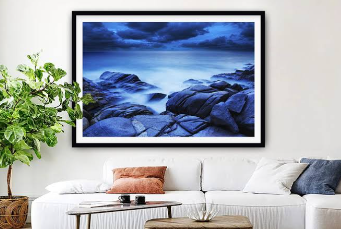
How to Choose Coastal Wall Art That Still Feels Personal

A room can be carefully decorated and still feel anonymous. The furniture may be attractive, the colours coordinated, and the accessories selected from the same style of catalogue, yet nothing tells a visitor why the space belongs to the people who live there. Art can change that. Coastal imagery is especially suited to personal meaning because shorelines often hold memories: a childhood holiday, a place visited with friends, a city where someone once lived, or a stretch of water that has become part of a family’s story. Choosing a print for those reasons makes the decision more lasting than matching it to a cushion.
Begin with the experience you want the artwork to preserve. It might be the quiet of an early walk, the energy of a crowded summer beach, the scale of a cliff seen from a path, or the pattern of waves from a pier. These memories do not all require a recognisable landmark. Sometimes a photograph of wet sand or distant swimmers captures a feeling more precisely than a postcard view. Ask what detail you remember most clearly and look for a composition that shares its mood or visual structure.
If a location matters, consider whether the artwork should identify it directly. A recognisable coastline can become a conversation starter, especially when it is connected to a place that shaped someone’s life. A less specific seascape may be better if the intention is to evoke a feeling rather than document a destination. Both choices are valid. The important distinction is between art that means something to you and art that simply fills an empty wall. A personal image does not have to be expensive or rare; it needs to hold attention for reasons beyond its decorative convenience.
The frame and placement can help tell that story. A photograph from a favourite trip may suit a simple frame that lets the image remain the focus. A more atmospheric landscape can be given space through a broad mount. Hang the piece where it will be seen in ordinary routines: near the dining table, above the sofa, or along the route between the bedroom and kitchen. Art that is passed every day often becomes part of the home’s memory in its own right, gathering associations that were not present when it was first installed.
It is useful to think about the room’s existing character, but avoid letting a strict colour match make the decision for you. If the image is meaningful, it can become the element that guides the palette rather than merely fitting into it. Pull one restrained tone from the photograph into a throw, vase, or rug; leave other colours alone. If the image is monochrome, its neutrality can make it easier to combine with collected furniture, books, family objects, and changing textiles. The goal is cohesion, not a perfectly matched set.
A personal choice also benefits from practical scrutiny. Check the artwork’s proportions against the wall, consider viewing distance, and make sure its tonal detail will remain clear under the room’s lighting. In a narrow hallway, a tall or compact composition may work better than a wide landscape. Above a large sofa, a small print can lose its significance even if the image is excellent. Test the dimensions with paper templates before ordering a frame, and view the arrangement from the doorway as well as from the seat where you spend the most time.
When you want a coastal subject but do not have one particular place in mind, browse broadly rather than searching only for the familiar bright-blue beach. The wider coastal art can be approached as a set of moods and compositions; a black-and-white coastal print may be especially suitable if the room already has a strong palette. Compare images by the feeling they create, not simply by the name attached to them.
Personal art is rarely chosen in one perfect moment. It often becomes clear after returning to an image several times and noticing that it continues to hold attention. Give yourself permission to wait, compare, and imagine the print in the room at different times of day. The right coastal artwork should fit the wall, but it should also connect to something outside the wall: a memory, a place, or a way of seeing the world. That is what allows it to feel personal long after the room has been redecorated.
Personal meaning should not be confused with the need to explain the artwork to everyone who visits. A photograph can be private and still be a good choice for a shared room. You might know why a particular stretch of water matters, while guests simply appreciate its composition. That double life is one of art’s strengths: it can communicate visually without requiring a caption. If the location is important to your family, keep the story in a small note or simply share it when the subject comes up. The wall itself can remain uncluttered. The most personal rooms are not necessarily the ones that display the most biography; they are the ones where the chosen objects have genuine reasons to be there.
References
Architectural Digest — Coastal Interior Design: Everything You Need to Know